
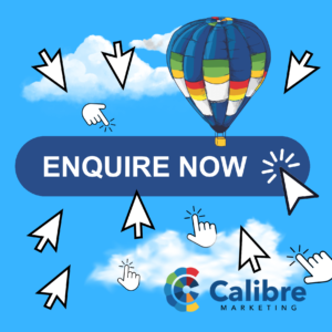
How to write copy that gets clicks
True or false?…
Changing one word in your button copy can increase your click-through rate by 90%.
…It’s true.
In a now-famous A/B test, the company Unbounce discovered that, by changing the button copy on their landing page from ‘Start your free trial’ to ‘Start my free trial’ they caused a 90% increase in their click-through rates.
That’s how important button copy is to the success of your marketing.
What is a button?
Buttons are the most common type of CTA (call-to-action) on a website. They are icons containing actionable words that entice users to click/tap and take further action.
Here’s an example:
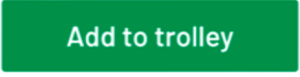
So what’s the difference between a button and a link? Buttons are generally used for the most important actions customers take on a site.
Button designs can vary, often being based on the company or brand guidelines. Generally a button should use a high-contrast colour so it stands out on the page.
Use 4 words maximum
User experience (UX) data proves that the highest performing buttons feature a maximum of four words. If you really need to use more than four words for a call-to-action, make it a link rather than a button.
Start with a strong verb
A verb (or doing word) should be the first word in your button. Use a strong verb to communicate value, not effort; receiving, not giving.
Words like submit, activate and pay are all verbs, but these verbs imply effort, not reward. Higher-performing verbs include: go, receive, enjoy, discover etc.
For example, in the columns below, the verbs on the left emphasise giving (and heighten anxiety), whereas the verbs on the right emphasise receiving (and reduce anxiety).
Don’t use |
Do use |
| Submit | Receive |
| Request | Enjoy |
| Register | Discover |
Use first person (my)
- First person: Get my free sample
- Second person: Get your free sample
- Third person: Get a free sample
First person buttons typically perform better than second or third person buttons.
If it ain’t broke…
According to Jakob’s Law, customers spend most of their time on other sites, which means they expect and prefer your site to function in the same way.
When it comes to generic but widely adopted buttons, don’t overthink them, just stick with the status quo. For example, on retailers’ sites, customers expect the following examples of button copy:
- Buy now
- Add to trolley
- Checkout
- Shop now
- Add to wishlist
Customers deliberately look for and expect this kind of copy on buttons. Any slight change could distract or confuse your customers, leading to bounces or abandoned trolleys.
So when it comes to common buttons, stick with what customers expect.
Test it
It’s worth A/B testing different copy variations for buttons. You’ll never know if ‘Sign up’ or ‘Create an account’ (both of which say the same thing) performs better for your audience until you test them against each other. If you, or your client, can’t afford to test the button copy, take your lead from big, famous brands – the ones who can afford to test their button copy.
For help writing copy and creating buttons that make people click, please contact Calibre.